How to use brand colours in web design.
Ridgeway
23 Apr 2020Print vs digital brand guidelines
Any project will start with analysis of client’s brand guidelines. These are a core part of any corporate identity (CI), usually in a beautifully laid-out document providing instructions of how to convey the brand consistently.
But in our experience at Ridgeway, brand guidelines are traditionally skewed towards print, with often only font, colour and a web page mockup provided for digital guidance. This is great in the sense of the creative freedom and possibilities it gives us, but we must always be aware of our responsibility to the client’s CI.
For Design and UX our priority is always to transfer the brand as closely as possible to maintain brand integrity. If we must stretch the brand guidelines for any reason including colour the decision will be based on improving or enhancing the user’s experience of the website.

How to create a clear hierarchy using a colour palate
We have mentioned creating hierarchy in other Design and UX blog posts. A clear hierarchy for page elements when used in conjunction with colour will allow emphasis on key areas of your page. Some ideas to consider:
- Prioritise calls to action (CTAs) with different styling. For example, use solid fills for primary buttons and border strokes for secondary buttons
- Vary the density of colour. For example, use larger solid blocks of eye-catching colour for the most important page action such as ‘Add to basket’. Using less colour on secondary links with the underline in colour works well
- Use different colours for different tasks. For example, use a more eye catching colour for primary tasks and a less bold colour for secondary tasks
- Use colours logically and that make sense to users, i.e. green for positive reinforcement and red for negative.
Choosing and using a digital colour palate
We’ll refer to our client Twinings in this article, but you can see similar techniques applied across pretty much all our client portfolio. You can find out more about our work with Twinings here. Twinings has a vast colour palette to cover their product range. We were provided with nearly 100 colour references which we then compiled into a workable palette which you can see below:
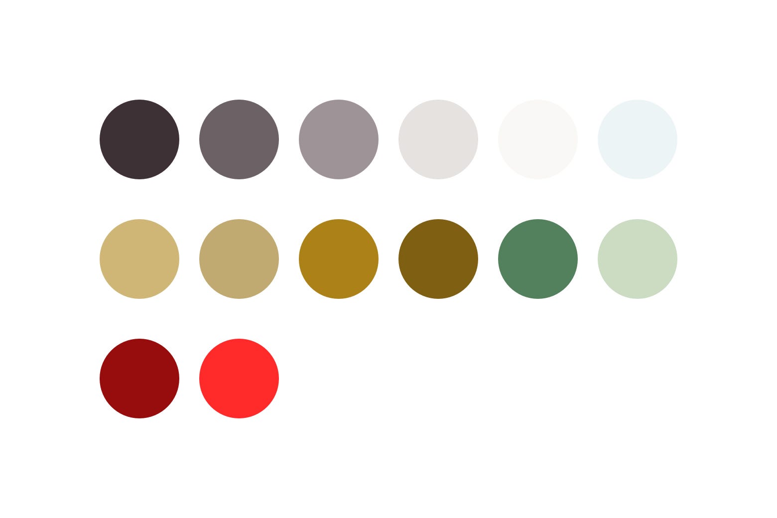
The approach of reducing the palette down was necessary for two reasons. Firstly, to ensure the website was manageable long-term for the client when using the content management system (CMS) to update content and create new pages. And secondly, to support a great UX by keeping things clean and uncluttered, whilst retaining strong consistency with everything from product packaging to in-store POS.
The psychology of colour use in web design
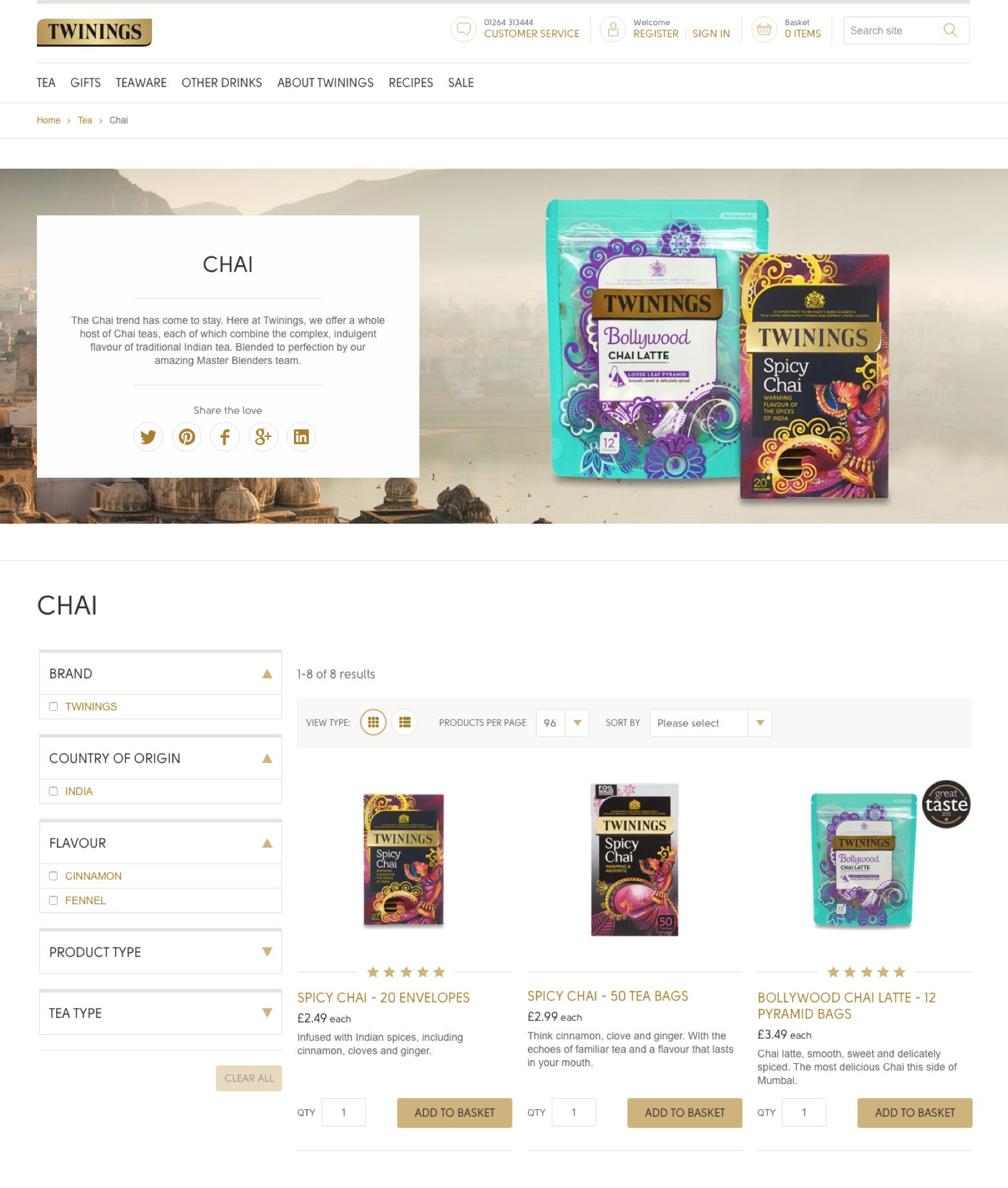
Colour helps to convey a brand’s character. And it’s also there to frame your content or products. In either scenario it’s a supporting role rather than the star of the show. This can be highlighted with Twinings, where product appearance was an important consideration due to the use of bright, bold colours from across the colour spectrum, supported by beautiful life style photography. This meant that the overall design needed to be light, subtle and calming to support rather than compete for visitor’s attention.
How to use brand colours in UI design
The Twinings gold appears on the logo and all packaging. By using this for CTAs and links, we pull the overall solution together - building a clear and understandable UI for users to interact with throughout their journey and ensuring brand integrity.
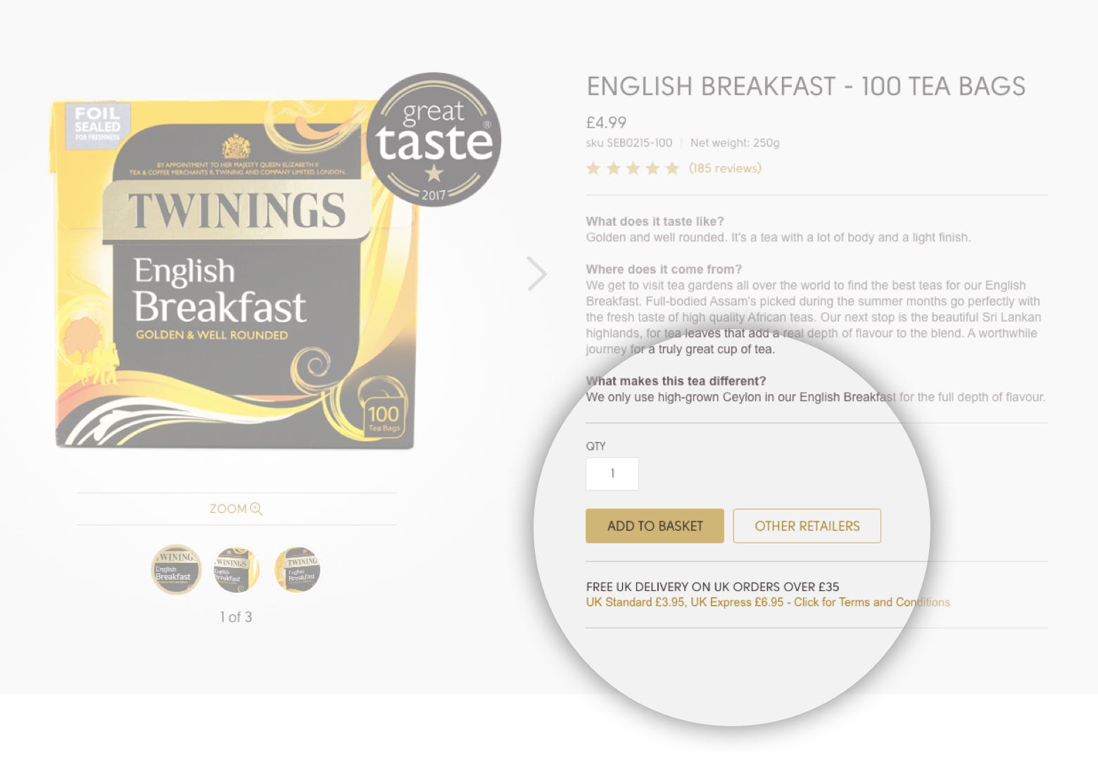
In the above example of a product page you can see how using a solid fill and a border stroke for prioritising can work, as the solid ‘Add to basket’ button achieves greater stand out.
How colours can help with web accessibility
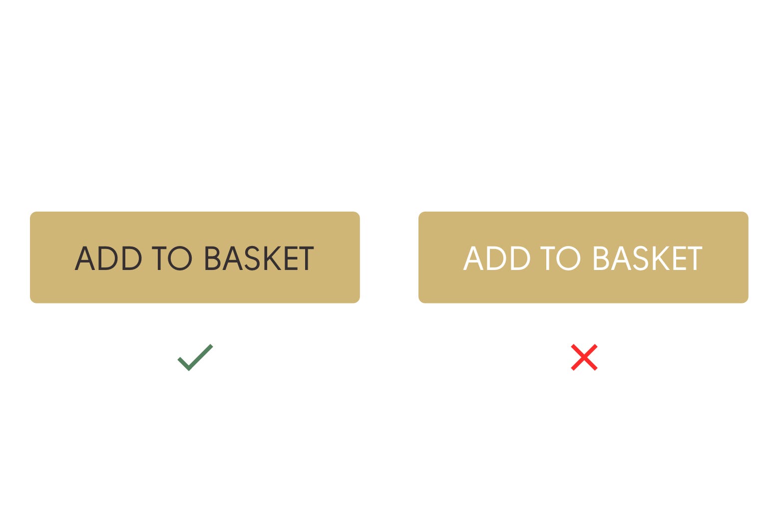
Accessibility is important if you want to avoid users having issues interacting with your website. Along with text size, colour plays a key role. The ideal scenario is to have a strong contrast between the foreground and background to ensure legibility. For Twinings, this is why black was chosen for the solid gold buttons, rather than white on gold. There are plenty of online resources where you can check this, including webaim.org.
Trust your instincts and use colour logically
This may seem obvious but use colour wherever possible in a way that makes sense without making your users have to think or question. An example is colour for notifications.
We learn from an early age that red means stop and green means go. This is why generally you will see websites resort to using green for positive notifications and red for warnings. There are times where use of these traffic light colours is recommended, and by using them sparingly and with tones that fit with the rest of the CI, they can enhance the UX without breaking brand guidelines.
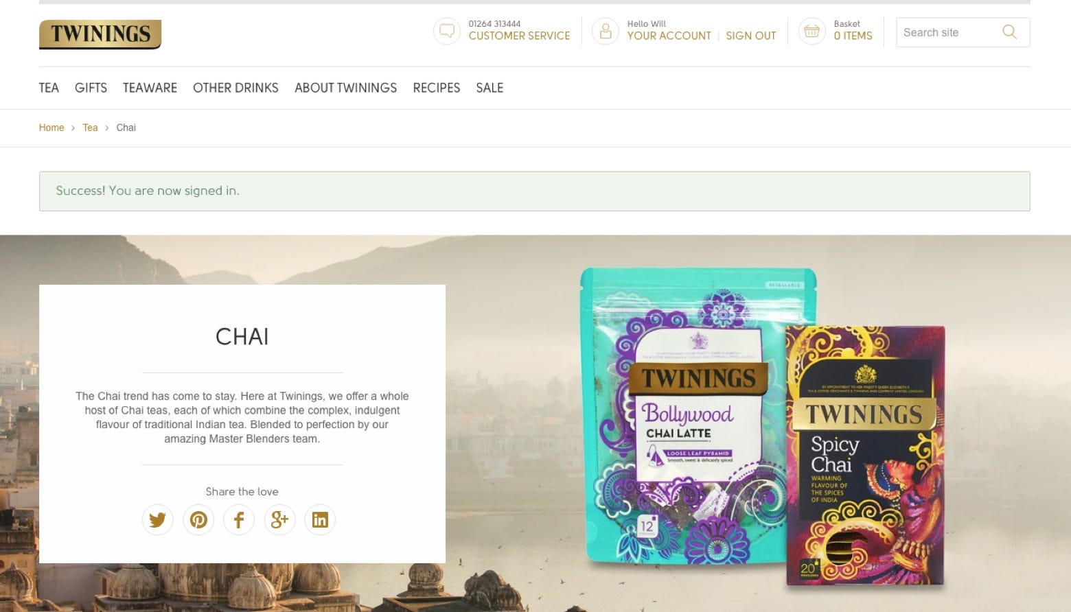
You can see this logic applied in the image above. The green is only used for positive feedback between the website and the user - providing confirmation of a successful action. It’s clear and fits within the design language while standing out enough to be noticed and understood.
The importance of colour in web design
Colour is an integral part of a website’s visual make up. It’s part of the brand language and conveys personality. But it’s also there to do a job - to help your users achieve their (and your) desired goals. So don’t think of colour as something there to simply look nice. Make your brand colours work for you.