Blog
Improving your website with typography.
Ridgeway
What is typography?
In simple terms, typography is the art and technique of arranging type to make written language legible, readable and appealing when displayed.
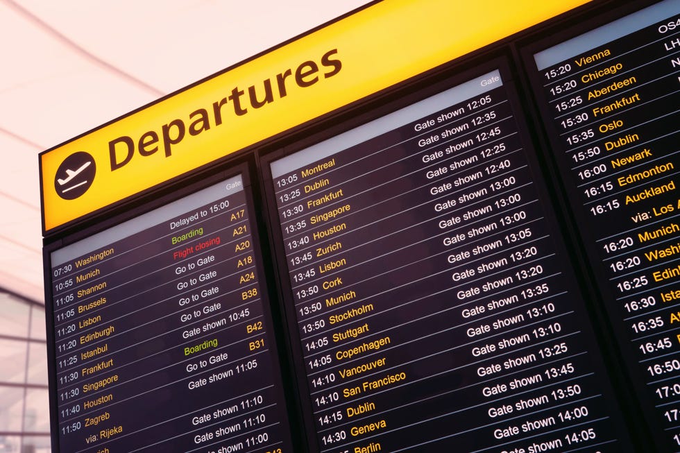
Take the departures board (pictured) for example. These boards display a large title to help passengers understand the context of the travel information. The flights are set using vertical and horizontal spacing, colour and title casing to help passengers scan the information quickly so they are able to find the exact flight they are looking for.
A departures board is purely typographic in its design to display information. It’s not something people necessarily encounter daily. Often when interacting with a departures board, time is of the essence. Therefore, applying typographic styles aids the passenger and is more user friendly, which ultimately is a core goal for any website.
So, how can you ensure your users are able to understand the information on your website as quickly and as easily as possible? To put it simply, by using better typography - which is the reason getting it right is so important.
The following principles will help to shape your site to ensure it is typographically sound.
Why is typography important?
Oliver Reichenstein from ia.net. claimed that web design is 95% typography. If we take Oliver’s claim, it almost places the entirety of any digital project as typographical. Most projects do tend to get consumed by imagery which perhaps is understandable, as we are all aware of the phrase ‘a picture speaks a thousand words’. As with most aspects of web and digital we perhaps need to disrupt this thinking to understand that the words and how they look need to speak as clearly as the images.
What is the difference between typefaces and fonts?
Before we get into any detail, it’s good to know the difference when we are talking about typefaces and fonts. You can look at it like this. The typeface is the overarching family and a font is a specific member of that family. For example, Helvetica is a typeface and Helvetica bold is a font.
So, when it comes to typefaces you may already have a brand typeface in place. If, however you need to define one or more typefaces for your digital project, here are some key points to keep in mind to help you decide:
Body Fonts - It is best to start by choosing the body font. This font will be the anchor and be used for 95% of your sites copy, so getting this right is really important.
Consider what your site's purpose is. If it’s a resource that requires a lot of reading such as a magazine or blog site, a serif typeface would work best. Serif typefaces are generally considered the best choice when it comes to readability and reading speed because they help your eye track across a line. If your site is a brochure or ecommerce site with smaller bitesize pieces of content, a sans serif would be a good choice.
Consider what your site's purpose is. If it’s a resource that requires a lot of reading such as a magazine or blog site, a serif typeface would work best.
Pairing Fonts - Pairing fonts can help create greater uniqueness while providing a broader visual language. Having a broader visual language means you can apply more or less emphasis to certain content you feel needs to stand out.
There are no hard and fast rules for pairing, but in most instances, you want to look for typefaces that complement each other. It is worth considering contrast, because similar typefaces that are paired, rarely create winning combinations. An example could be pairing a distinctive title font with a clean, neutral typeface that has enough weight to add emphasis where required.
There are some great online font resources, including:
typewolf.com is a great place for web font inspiration
You can also consider super families. These are typefaces that offer a wide variety of weights and styles which work harmoniously together.
Super families can consist of a number of styles such as serif, sans serif, condensed and extended which provide the opportunity to create a hierarchical visual language without having to spend a time finding the perfect combination. Some examples of super families are Gotham, Museo and FF Scala.
However, it’s sensible to be cautious and not get too carried away because many fonts will have an impact on your site, including loading times. This is especially important if a large percentage of your sites traffic is coming from mobile.
How to choose the right typeface
Typefaces convey mood, emotion and personality. Therefore, it’s important to question if the typeface you have chosen is appropriate and whether it projects your brand’s values.
They are also designed with specific usages in mind. The two most common
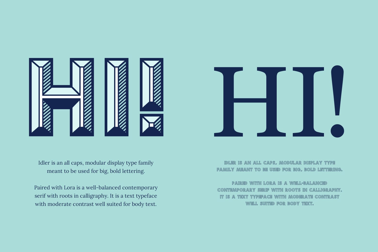
typefaces are used in headlines or as paragraph text. Typefaces designed for headlines might be bold, condensed or decorative, which is fine in larger sizes since they are created to be impactful. These traits however, might not work at smaller sizes and may become difficult to read. Vice versa, fonts designed to be used as paragraph text may not have the impact or be distinct enough when enlarged for headlines.
The example below illustrates this using the typefaces Idler and Lora. While Idler is a bold and impactful font for headlines it could never be utilised for smaller text as its completely illegible.
What is visual hierarchy in web design?
Visual hierarchy is the process of arranging elements in a way that establishes importance. By creating a visual contrast between forms, you are helping your users by guiding them to the content with the highest contrast first. The four main ways of achieving visual hierarchy with typography are:
Size weight and casing - This is the easiest and most impactful way to create visual hierarchy. By having a good range for your H1-H6s you will be able to emphasize messaging from page titles through to call to actions. With weight, it’s important to ensure there is enough differentiation, for example regular and bold.
Positioning - Positioning can also be used to create visual hierarchy. By centering your header tags and right aligning copy, you’re giving emphasis to the titles.
Typeface - Combining contrasting typefaces will create distinction. For example, Wired.co.uk use New Grotesk Square for headings and Brutal for the introduction, both of which are sans serifs and for the body of the text they use Exchange Web which is a serif font.
Colour - Applying colour to key text or messaging will add definition to the visual hierarchy.
Rhythm - Like music, typography also follows a pattern, this is called the vertical and horizontal rhythm.
Vertical has the greater impact on hierarchy as it addresses the spacing between lines of text as well as spacing between all objects. Horizontal rhythm effects the spacing between the letters and the words which influences the readability of the typography.
These rhythms are important because they build visual consistency into the page and users will learn as they navigate through your site by understanding these typographic patterns. So take time to read the content within the designs and see how it feels navigating around the page to see of the spacing is right.
What’s the best paragraph and line length for responsive websites?
It’s important to remember the impact that responsive design has on your site, so shaping your content to react accordingly is key. As of 2017, the consensus of the optimum character line length is between 45 - 75 characters max.
When it comes to paragraph lengths, a four-line paragraph will double in line length on mobile, so it’s good to keep this in mind when shaping content. The BBC has a page aimed at Journalism called ‘Writing for mobile: Bite-size basics’ which the title sums up perfectly. Keeping your paragraphs short and succinct will ensure less scrolling, which, from a user’s point of view is most certainly beneficial.
Why you shouldn’t use justification in web design (or print)
One thing you should certainly avoid at all cost is justification, and to be honest, it’s never great whether it's applied to web or print. The reason you should NOT use justification is quite simply because it’s harder to read. This is mainly due to the large gaps which form between words and in turn interrupt the reading flow. It may look neater with respects to the gutters (space between columns), but from a user’s point of view it’s easier to find the line when they are uneven. So, unless you’re a design focus or rule breaking extreme sports publication, justification is best avoided.
The reason you should NOT use justification is quite simply because it’s harder to read.
Takeaway tips for taking web typography to the next level
If you are about to embark on creating a new website from scratch or a refresh of an existing site, it’s really important to get the typography right from the start.
Scheduling time to ask questions and give appropriate consideration to typography will only yield better results.
Website typography checklist:
- Do you have an obvious headline and body typefaces?
- Do they complement each other and provide clear contrast?
- Super families - which provide variety and are designed to work harmoniously together.
- Think about the information hierarchy and how your typeface can best do this through size, weight and colour.
- Remember that web is a different medium to print, so utilising methods that may work in print such as justification don’t always translate to web.