Top web design trends to look out for.
Ridgeway
08 Jan 2018Here are some key web design trends to consider if you’re planning a new website over the next 12 months.
Broken grid layouts
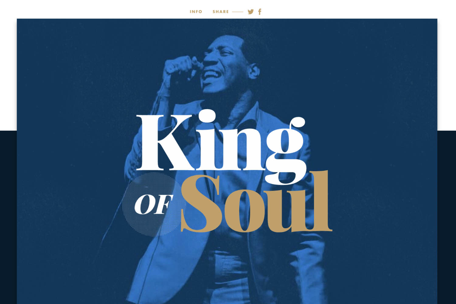
I mentioned broken grid layouts in last year’s blog and this is still valid for inclusion for 2018. The broken grid layout is a reaction against bland and formulaic page structures. Instead of content lining up in clear visible columns. Content will instead, align at different points as you scroll. This creates a more engaging way to introduce content as illustrated by kingofsoul.storytelling.design.
Considerations:
- Use large, bold typography throughout
- Layer content such as images over block colour
- Vary how content is shown using multiple layouts
Transitions
Transitions can help inform, guide and engage users when interacting with your website. From bold typographic navigations to immersive storytelling. Transitions can make your messaging a more fluid and seamless experience through animation as can be seen here: geex-arts.com.
Considerations:
- Use transitions to create immersive and dynamic story telling
- Be consistent in your animation approach
Clipping and masking
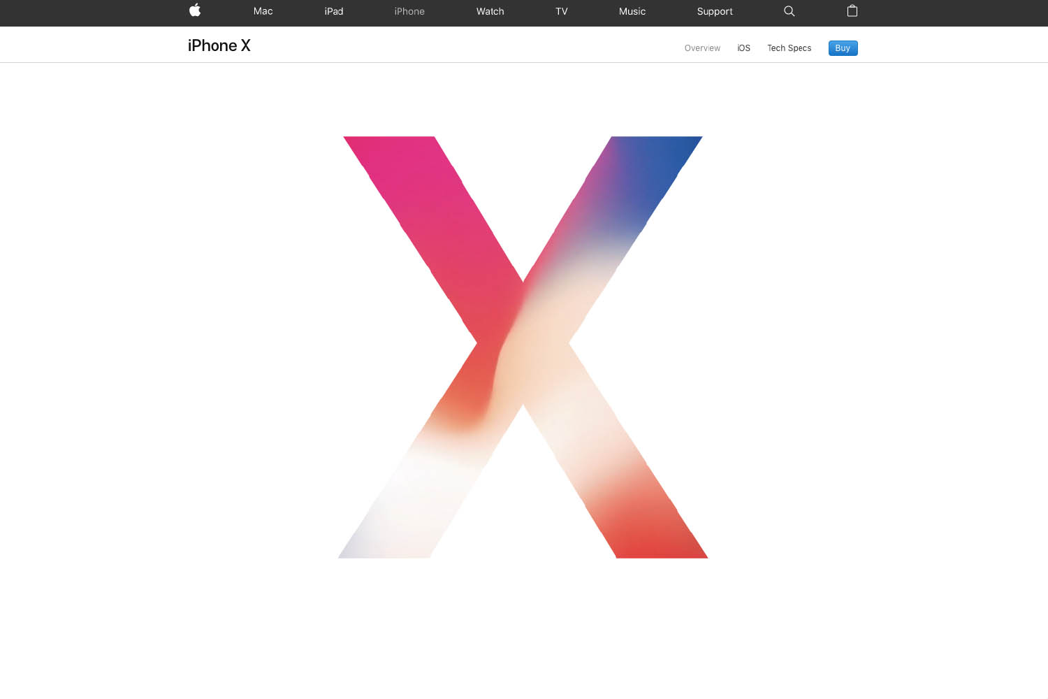
Clipping and masking is not a new technique and had a greater presence towards the end of 2017. The technique hides part of an image from view while the rest can still be seen. The trend is to mask colour, texture, images with typography although shapes can be used also. Apple used this for there recently launched i-phone X site.
Considerations:
- Use to create bold, intriguing and dynamic designs
- Consider your users as these techniques do not currently have complete browser support
Round UI
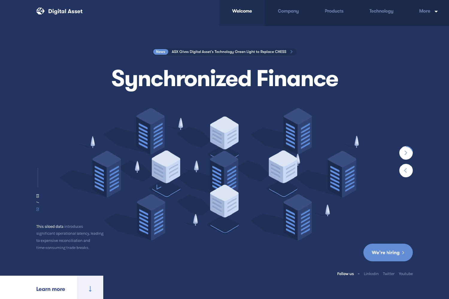
Web design has been dominated over the last few years with crisp, hard angular UI. In 2017 there has been a move towards more rounded UI design lead by apps including Skype, Facebook and Twitter. Expect to see more rounded design in 2018 with websites like digitalasset.com building greater visual unification between apps and websites.
Considerations:
- Use if you want to convey a more friendly and approachable tone of voice
- Get the balance right. Angular and rounded elements can complement each other while giving priority
Minimalism
Minimalist design is a style that’s ever present. With notable companies including Apple and Airbnb adopting the approach in 2016 it’s safe to say they were ahead of the curve. So why should you consider the less is more aesthetic? A minimalist approach will lead to a streamlined design language. This will improve performance as less design assets mean faster loading times.
Considerations:
- Greater importance is placed on typography so it needs executing perfectly
- Only include elements necessary to the page’s goal(s)
Key messaging above the scroll
Another trend from the minimalist approach is to have only a key message above the scroll. With no image in the background this is a pure typographic approach. Ensuring your proposition stands out front and centre when users land.
The key for this approach to work is keep wording to a minimum. This creates visual impact whilst at the same time allows for the content to react responsively on different devices.
Considerations:
- Use short words which resonate and convey your USP’s
- Choose a typeface that has interest while fits with the messaging
- Use white space to allow the words to breathe and for the user to either skim read or flow over paragraphs
- Use colour either block or flashes of colour to add brand recognition
Conclusion
Whatever your plans are this year for your website, investing in the right new technologies and trends with a clear UX path and online strategy will ensure your product or service can capitalise on both existing and new customers alike.