Blog
Laws of UX 1/3: Hick's Law.

Tim Pennells
In today’s digital landscape users are bombarded with choice. Although in many cases choice is a good thing, sometimes a user needs guidance on where to go next. If a user is presented with 20 options within a menu it will generally take them longer to make a decision on what option to choose over a menu with only five items in it.
Applying Hick's Law to your next web project
This is part one of a three-part series on the Laws of UX and how we apply them to our work here at Ridgeway.
You can read the other two posts here...

The Laws of UX are a set of 20 principles (we’re only covering three) which can be applied to a variety of user experiences. In our case, it is usually web projects and products, but they can be applied to product design, software development and many other scenarios. The Laws were collated a few years ago by product designer Jon Yablonski and have quickly become a good reference point for UX Designers and Product Owners who are looking to consider UX throughout the project duration.
The laws are grounded in strong psychological research by well-respected psychologists and designers. The original publication is well worth a read and if you can take away three or four laws and keep them front of mind for your next project this will be a big benefit to your users.
Hick’s Law
The time it takes to make a decision increases with the number and complexity of choices
How do we reduce decision making time for users?
The longer it takes for a user to find what they are looking for the more likely they are to get frustrated and stop using the product. There are a few ways in which we can speed up the process for the user.
Break complex tasks into smaller chunks
The best example of this, is how we break down the payment process for our ecommerce websites. This is the hmvstore payment process…
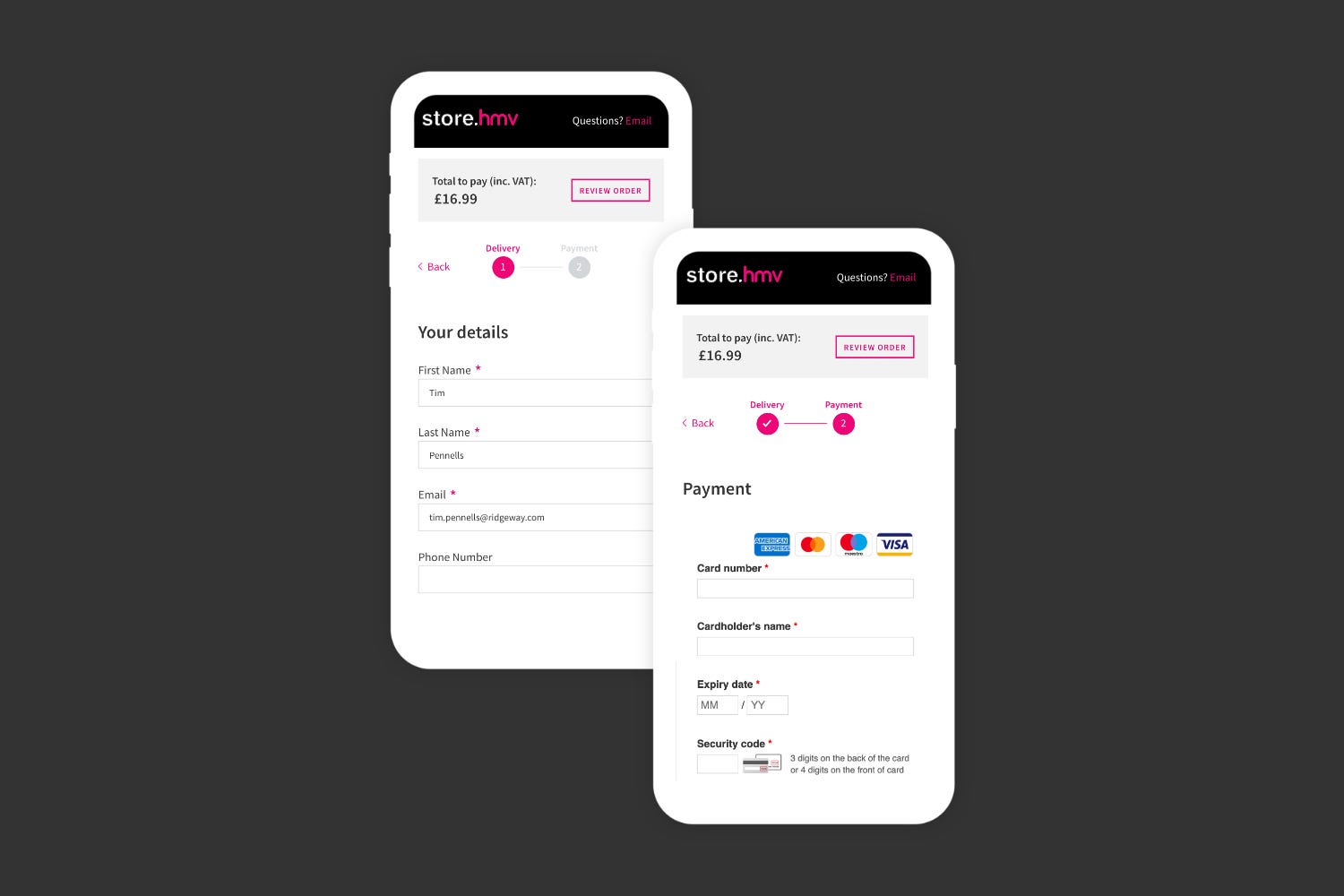
We’ve built in a two-step process for purchasing goods through the hmv site. This allows the user to focus on completing one task at a time. It is a very common practice for ecommerce websites where the site is asking the user for quite a lot of information. If the perceived number of tasks on a single page is reduced down, then a user is more likely to complete the tasks.
Provide a clear hierarchy of information
Better decision making comes from prioritising and highlighting the important information so that a user completes their search for information quickly. Having a clear page structure with appropriate headings, obvious primary and secondary call to actions and clear links will help direct a user to their next step. Their next step could well be some more reading, viewing another product, using a form or purchasing a product.

We built the ecommerce solution for Probiotics experts, Optibac. The product detail page for this site encompasses some of the theory behind Hick’s Law.
The makeup of the page allows a user to quickly identify and read important information. The structure of the typography means that prominent text information such as the product title, price, pack size and delivery options are all clearly identifiable. This can be illustrated by the hierarchy in text size for the headings below:
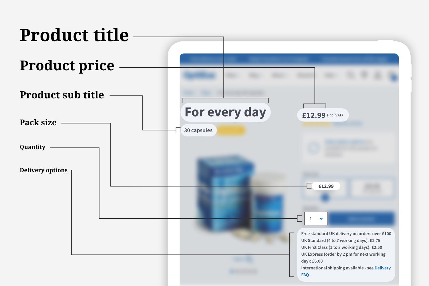
The illustration above shows the clear hierarchy with the larger pieces of text being the most important information (aside from the ‘Add to basket’ button, we will come to that in a minute). The items then reduce in size down to delivery options which are still important but not as important as price.
Highlight really important information – the ‘Add to Basket Button’
In the OptiBac example, we can see the ‘Add to Basket’ button is styled in a way which highlights it on the page. There is only one element on the page which is styled as a blue button. This is a clear signal to a user that this is the primary action to be taken on the page. Highlighting important information or actions can focus the user and drive them to make a conversion. Good for the user and good for the business.
In addition to this having the quantity selector next to the button indicates that these elements are related and should be completed in sequence.
How do we apply Hick’s Law to our projects?
During our research and discovery phases we tend to use a set of techniques which help us to define and prioritise information for our users.
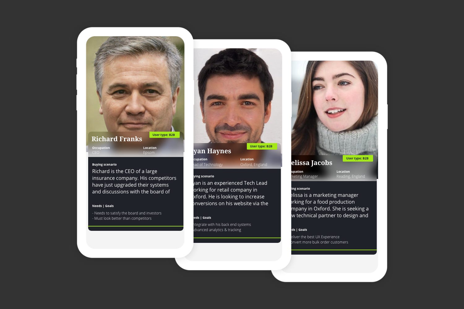
User Personas
Having a solid user persona(s) based on data and research can be very valuable. It provides context for the whole project as every decision can be made in view of what your persona needs.
If you don’t have research and data to back up your decisions you can use Proto-Personas, based on best practice and the experience of your team.
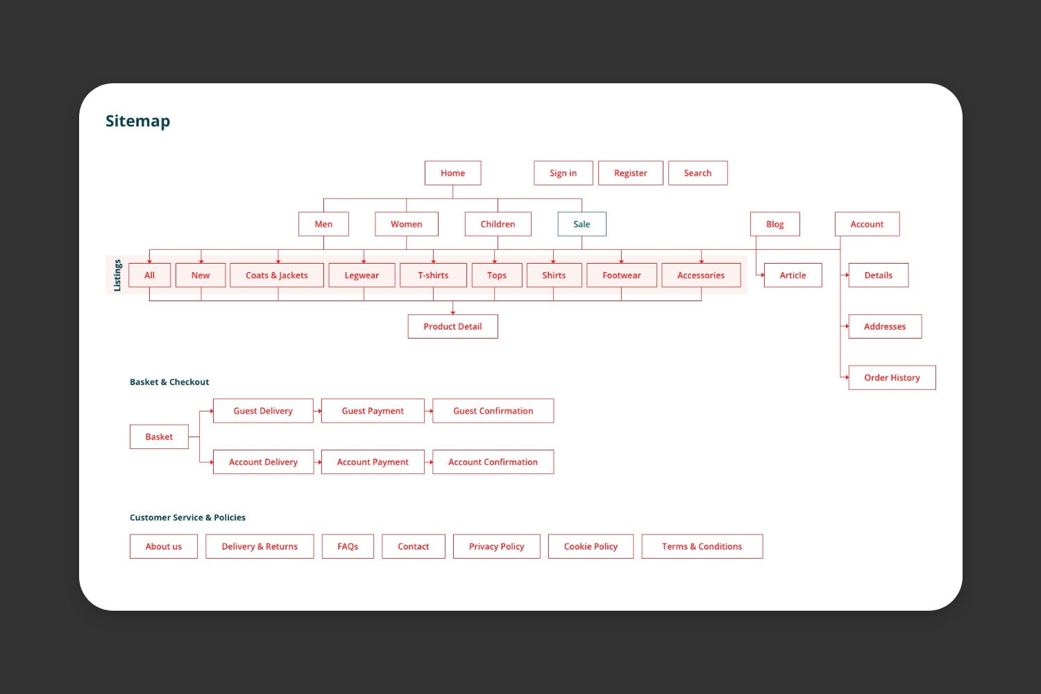
Information Architecture (IA)
The information architecture of a website or digital product is a key element to get right when dealing with lots of content types. Quite often this type of work comes out in a sitemap.
Having a well-defined structure which brings important content to the surface for the benefit of the user is very important. The aim is to make the key content easy to find and not too many clicks away from the initial landing page.
Card Sorting
This is a simple UX technique which can provide really useful insights when structuring menus and categories of information. The way designers and developers group content may be totally different to the way a user would group content. The aim of card sorting is to uncover this way of thinking to design a menu which works for our users.
The takeaways
Less is fast – Provide the user with less options per screen and break down large tasks into smaller ones.
Order is everything – Give your users a structure they are expecting and prioritise key information.
Make it obvious – Make the ambiguous obvious. Give the user a clear call to action and highlight it appropriately.
This post covers Hick’s Law and how we apply it. The next post in the series will focus on Doherty Threshold and how the performance of a website can drastically affect a user’s experience.