Blog
Laws of UX 3/3: Jakob's Law.

Tim Pennells
Different is difficult for a user. Bucking the trend and creating a user experience which has never been done before is a risky business. Jakob’s law highlights the need to be familiar online so that your users find what they are looking for quickly.
Applying Jakob's Law to your eCommerce project
Jakob’s Law was devised by leading User Experience advocate Jakob Nielsen and is one of the major theories of User Experience Design. Humans are creatures of habit; we recognise patterns and learn from our past experiences. The people using your website currently will have visited many other websites in the past, they have built up experience and expectations on how a website should work. If your website does not match with this experience, then you run the risk of frustrating a user and losing their interest.

Users spend most of their time on other sites. This means that users prefer your site to work the same way as all the other sites they already know.
A website or digital product is not the place for design experimentation or radical new ways of thinking (unless it is backed up by evidence), it is a place for familiarity and consistency. Here are some ways to be consistent with your UX:
Competitor research
If your users spend more time on other websites than yours, evaluate how things are being done in your industry. Conducting competitor research is a great way to discover how users want their information displayed. It can also help you identify potential opportunities within the sector to provide useful information or features which your competitors are not. Some things to try would be:
- Audit your competitors’ websites
- Conduct a high-level inventory table of content and features – what content types are they providing to their users?
- Wireframe menu architecture – sketch out your website’s menu structure along with competitors
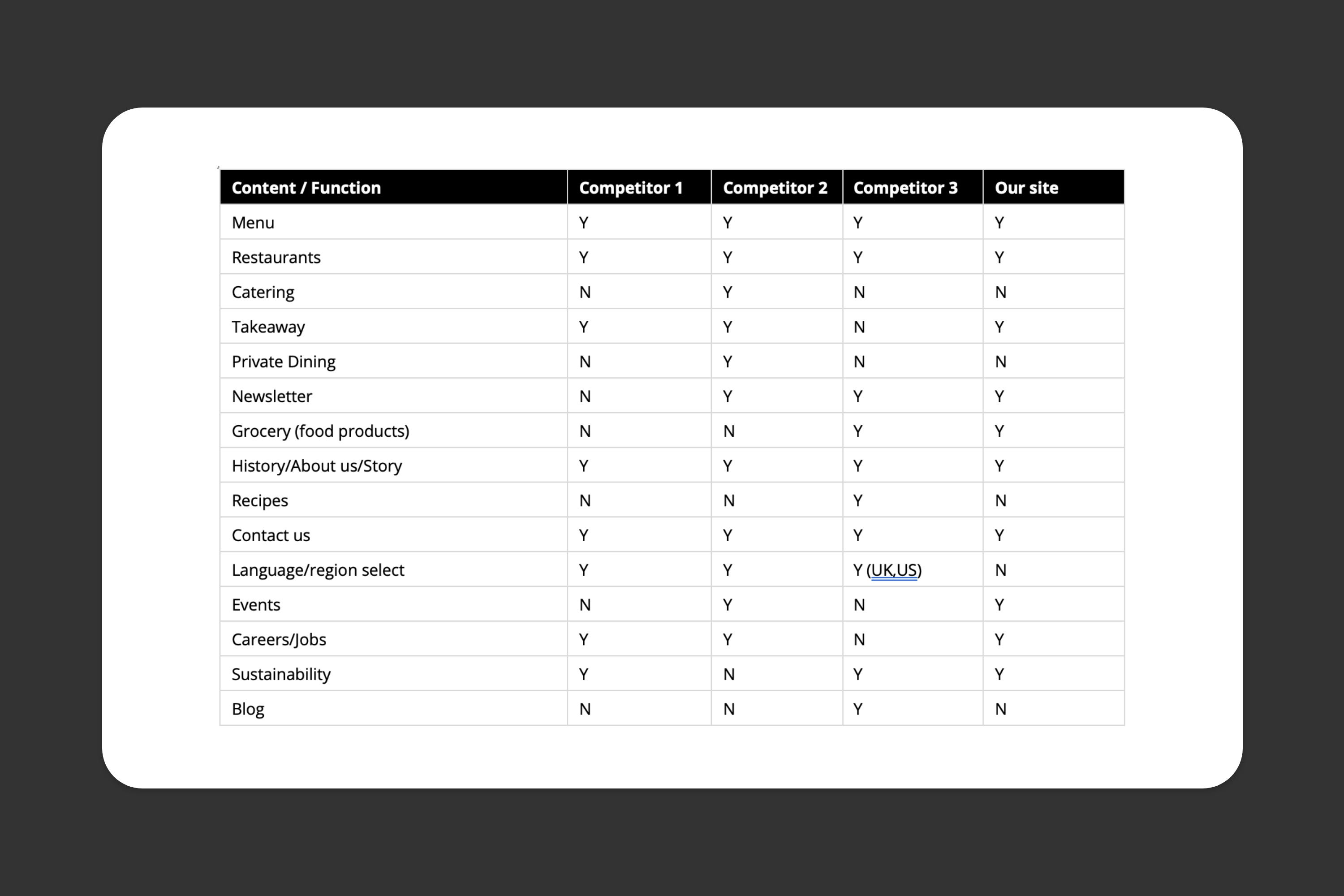
Example high-level inventory
User testing
How do you know what your users are looking for? If competitor analysis is only getting you halfway there, consider undertaking some user testing. Done properly user testing can be a project in its own right and it can yield some very powerful insights. If budget and time are major factors in your project you could consider doing some lightweight testing.
- Show your prototype or development site to people not involved in the project and ask them to complete a goal
- Begin gathering behavioural data with heatmapping software
- Conduct an onsite questionnaire
- Have screenshare interviews with a group of your users
These are all tasks which don’t have to break the bank and can be achieved in a relatively short timeframe – as long as your objectives are clear.
Labelling and taxonomies
Labelling and taxonomies refer to how types of content are named and grouped. This is important for a user, so they know where to find the information they need. For example, call it the About page rather than Ethos & Approach. Call it Add to basket and not Add to tote bag. Conform to web trends and make it simple for a user, don’t make them look for the information.
If you have multiple types of content and your architecture is complex, consider conducting a card sorting exercise with your users and stakeholders. This will help find common ground within the menu structure so you can design a menu which caters to users and makes sense to the business.
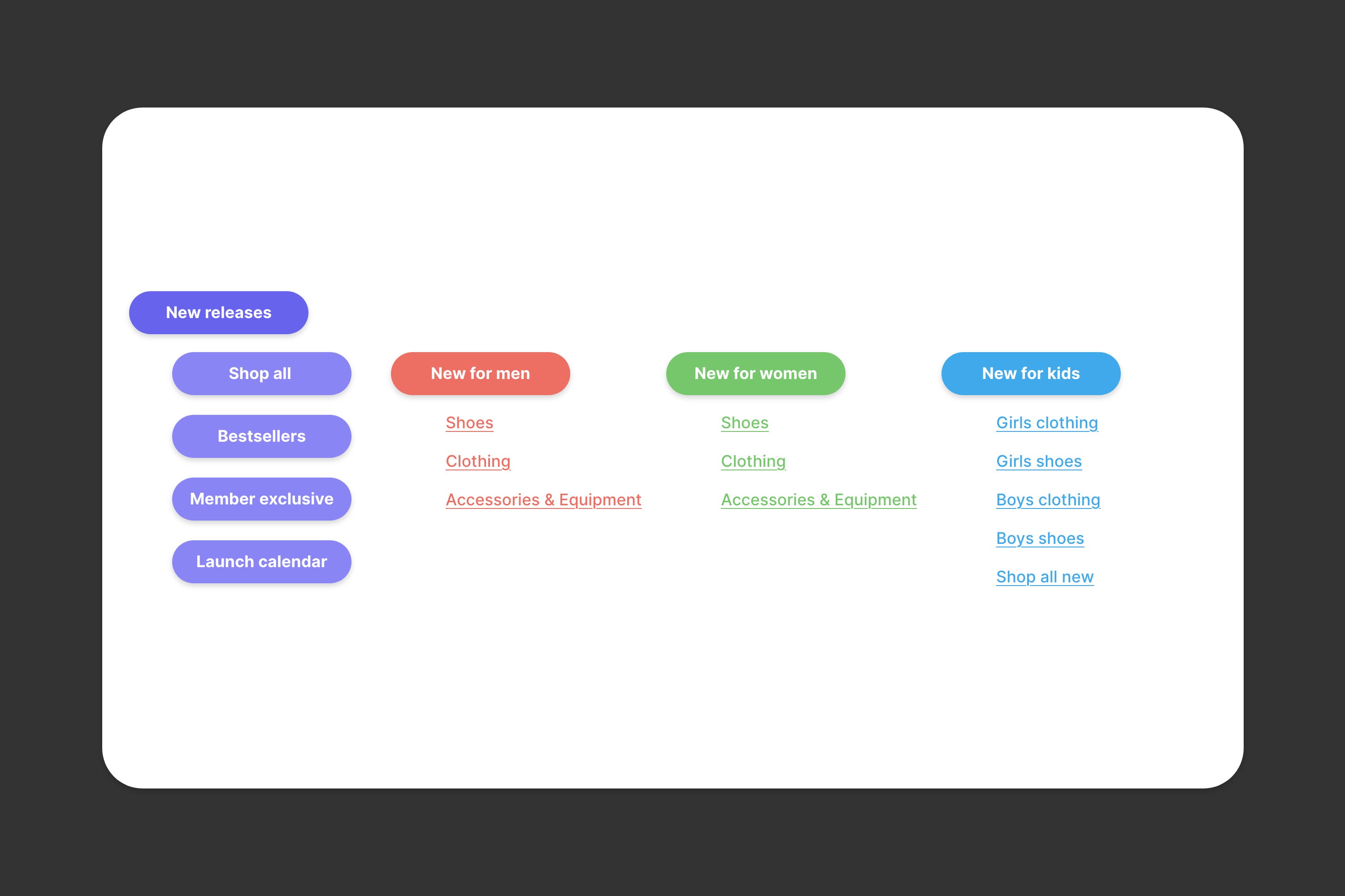
Example e-commerce labels and hierarchy
Design patterns
Throughout the web there are common patterns which most websites conform to. These are trends which have been built up over decades and which users are familiar with. For example, you would not expect to see the site’s logo sitting within the bottom right of the viewport, it is usually within the top left of the menu. Here are a few basic patterns which make most sense to users:
- Make buttons look like real world buttons, make them ‘clickable’
- Use breadcrumbs
- If you need to use a hamburger menu for mobile devices, place it on the right so users can reach it with their thumb
- Include a footer with useful links
- Break up large portions of text with headers
- Always change the colour of a visited link
- Keep line length to around 700px wide
Summary
Be familiar – Don’t run the risk of confusing users and conform to the industry standards when designing. Look at your competitors.
Listen to your users – Test your site against the expectations of your users and don’t design something which re-invents the website.
Name things simply – Don’t complicate things and name things for what they are. Does it sound like an About page? Call it an About page.
Take into account the history of websites – Don’t move the important elements and be consistent.
This concludes our series on the Laws of UX. For more insight about our UX practices have a look at some of these articles: