Krispy Kreme
Bringing a new flavour to one of the world’s biggest doughnut brands.
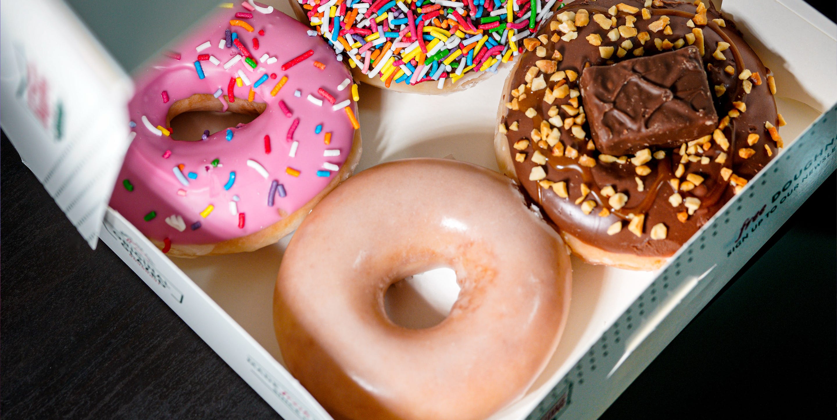
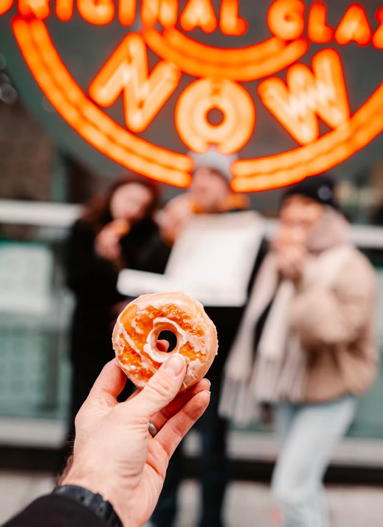
Since Vernon Rudolph bought a secret yeast-raised doughnut recipe from a French New Orleans chef in 1937, Krispy Kreme has been selling their mouth-watering treats to customers around the world through their signature display cases in every store. As a leading doughnut brand, Krispy Kreme wanted to build a wider love for its story and products by creating excitement and engagement amongst its online visitors with a more unique experience.
The website delivered impressive performance in its first six month period and continued to go from strength to strength.
Frying up something fresh
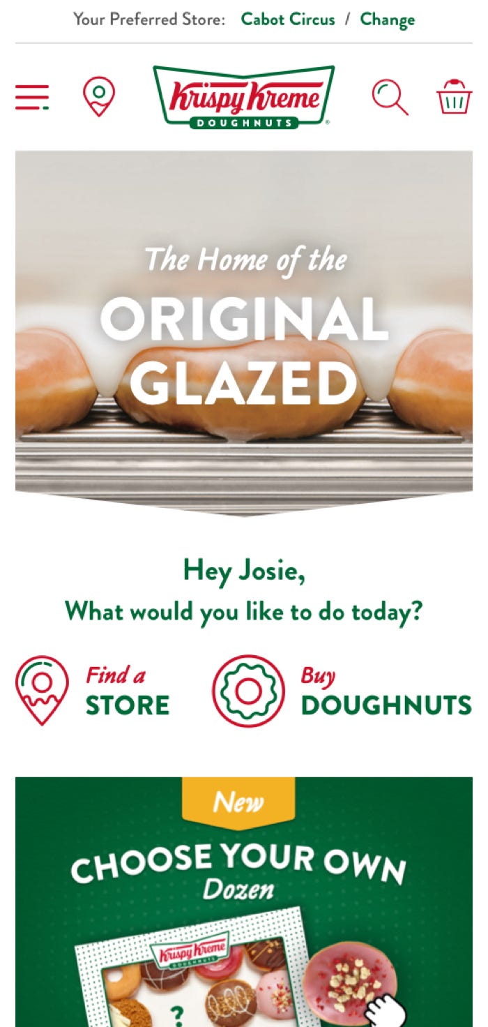
To build enthusiasm for the Krispy Kreme brand, Ridgeway created an immersive, interactive, and more personalised online experience that better reflected their brand.
Along with a complete re-design that is colourful, fun, and dynamic, this has significantly increased the loyal, returning customer base that interacts with the website. We also delivered a delightful mobile-optimised journey for a user-first experience, with customers enjoying a seamless collection and delivery process, an improved online reward scheme, and a single click checkout.
A sweeter way of working
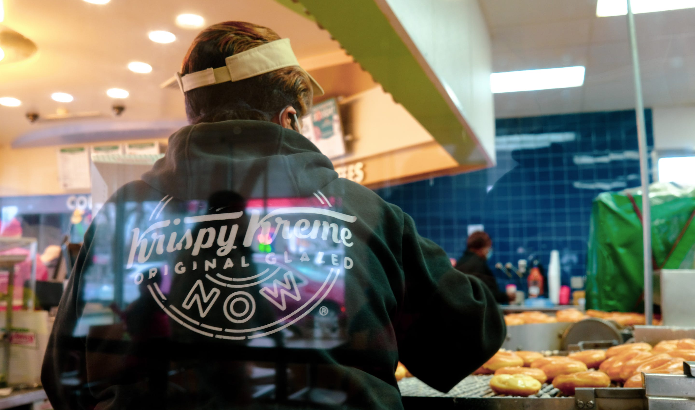
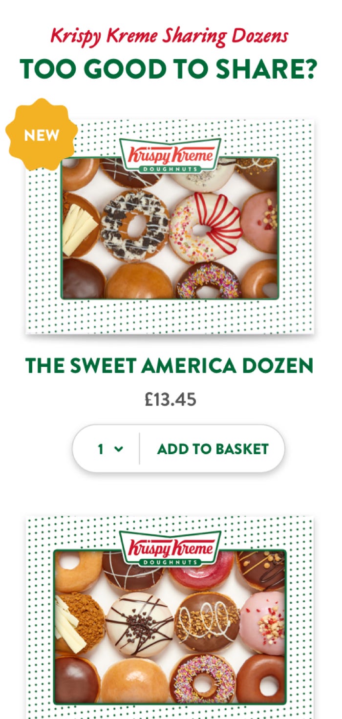
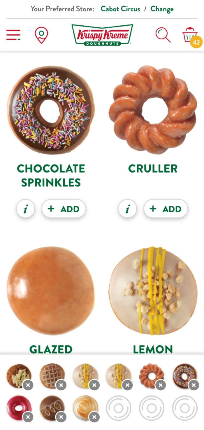
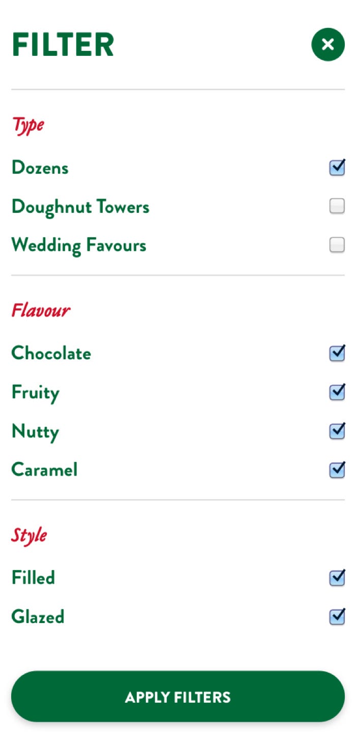
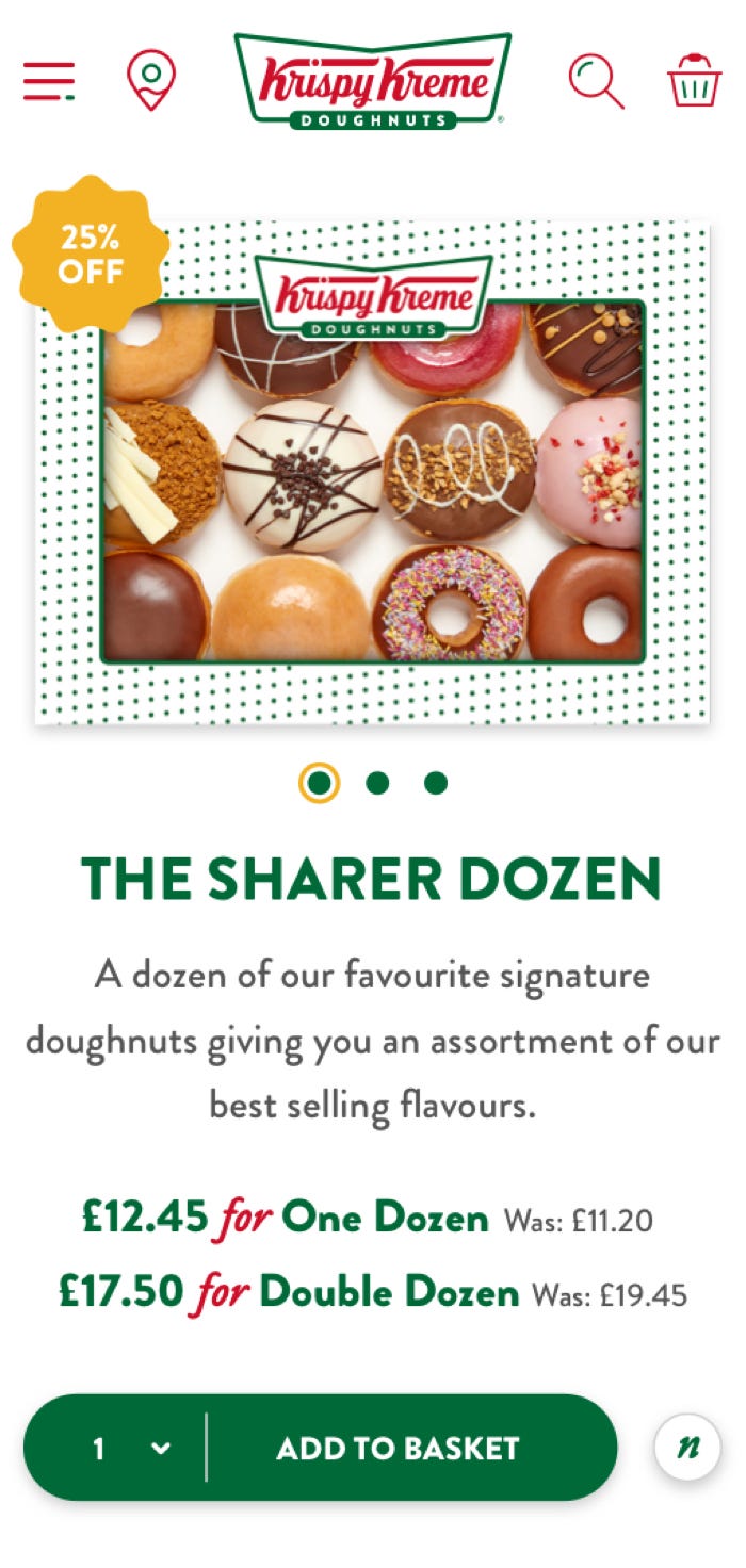
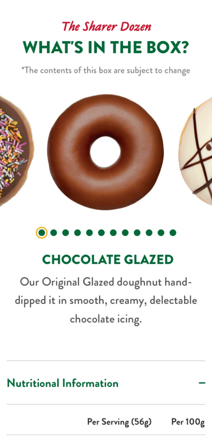
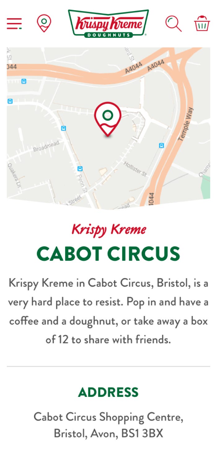
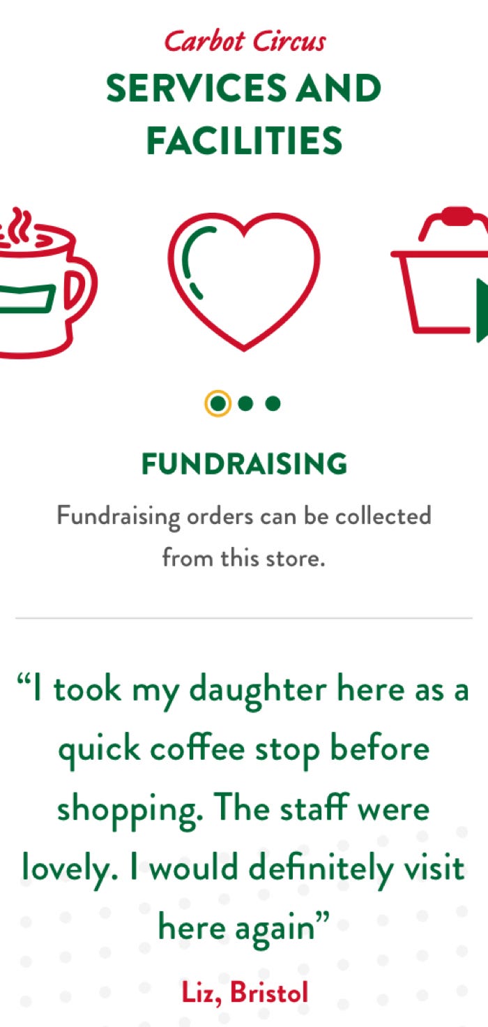
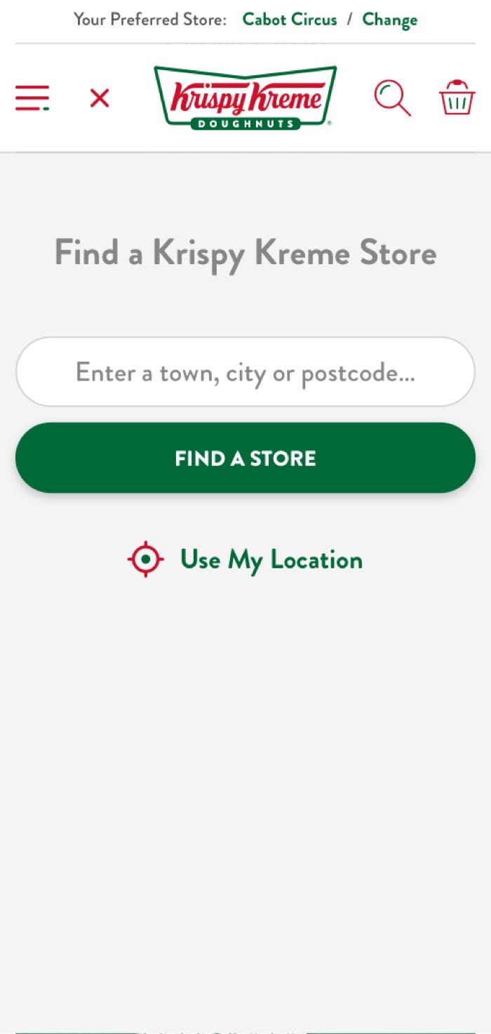
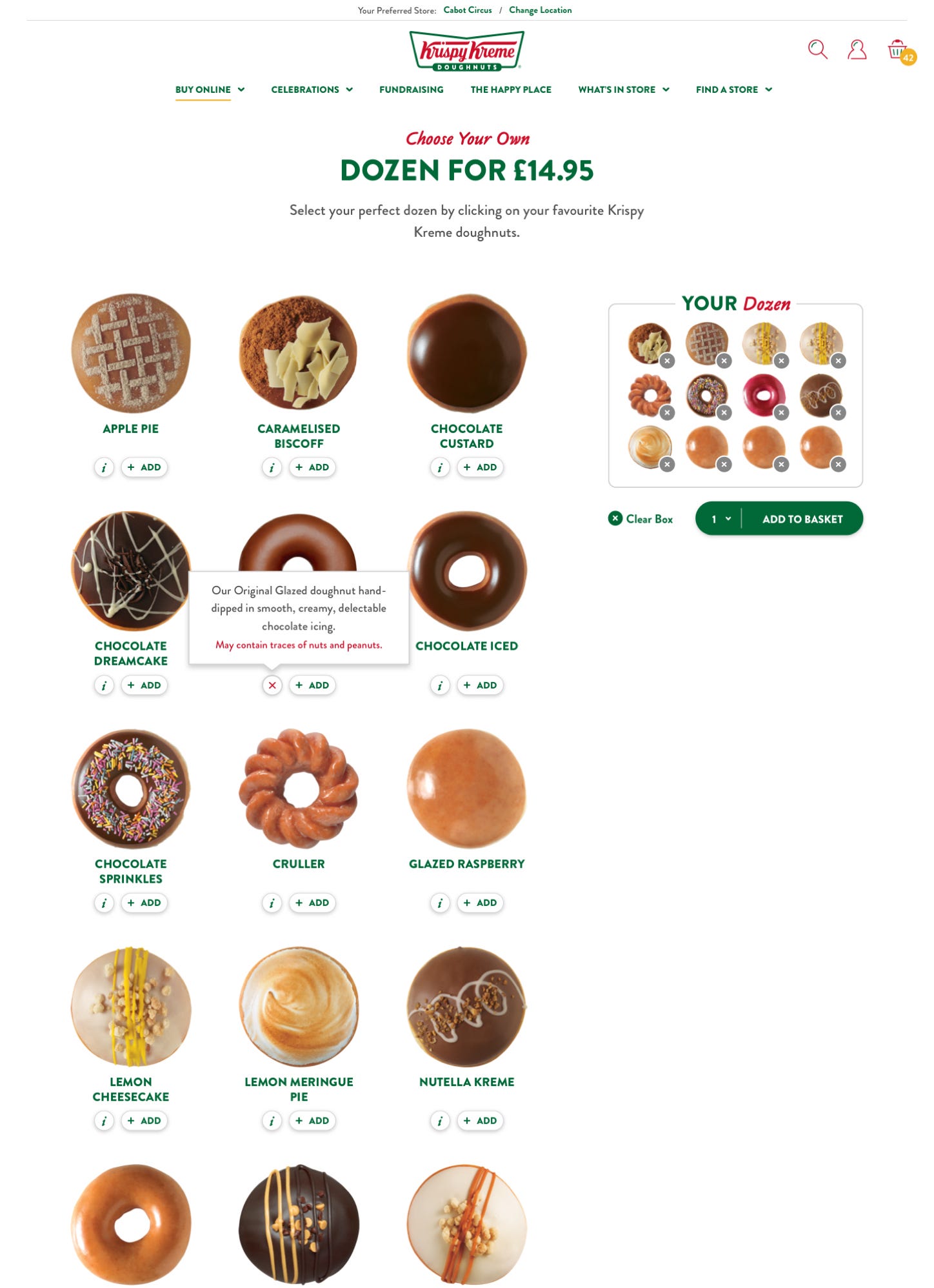
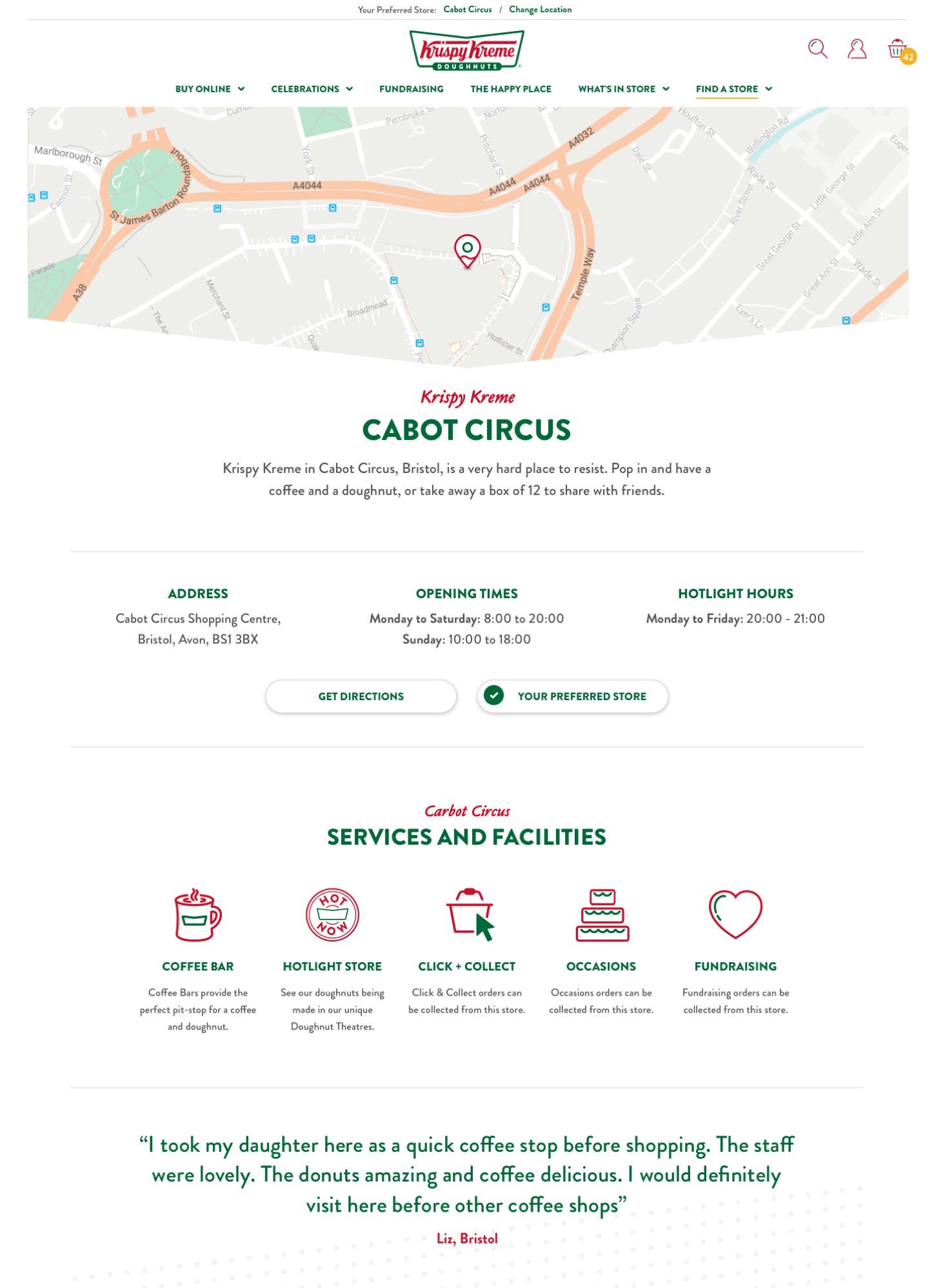
One of the key features of the new website was developing and implementing a back-office store order management system for all UK outlets. This provided a fast and efficient way for staff to put together and distribute daily doughnut orders, as well as enabling Krispy Kreme to increase their customer offerings through the Choose Your Own functionality, multi-tiered promotions and discounts, and subscriptions. Visitors to the website also benefit from visual order tracking, improved product and content search, and a store locator with geolocation.
Third-party integrations such as PayPal, SagePay, GTM, and Google Local Business have also helped to enhance Krispy Kreme’s internal operations and marketing activities.
Personality for every occasion
Awarded the site of the year at Wirehive 100 Awards, Krispy Kreme can now showcase their personalised products, messaging, and packaging with custom features and functionality. Customers engage with the brand through a new magical online experience, including the option to Click and Collect either the same or next day or delivery straight to their door.
Whether it’s a wedding, anniversary, engagement, or birthday bash, customers can explore hand-decorated doughnut towers, walls and make bespoke requests to make their day extra special.


We’re delighted to now be able to offer our customers the option to seamlessly purchase and receive our products. Our website is optimised, fast and user-friendly whilst providing an engaging environment for users to enjoy the brand. The results demonstrate the expertise of the team at Ridgeway.
